SMUD Headquarters Rehabilitation is the Architizer Project of the Day
August 5, 2022
From the August 5, 2022 Journal of
Architizer.
by Architizer Editors
Dreyfuss + Blackford Rehabilitate the 1950’s SMUD Headquarters Building
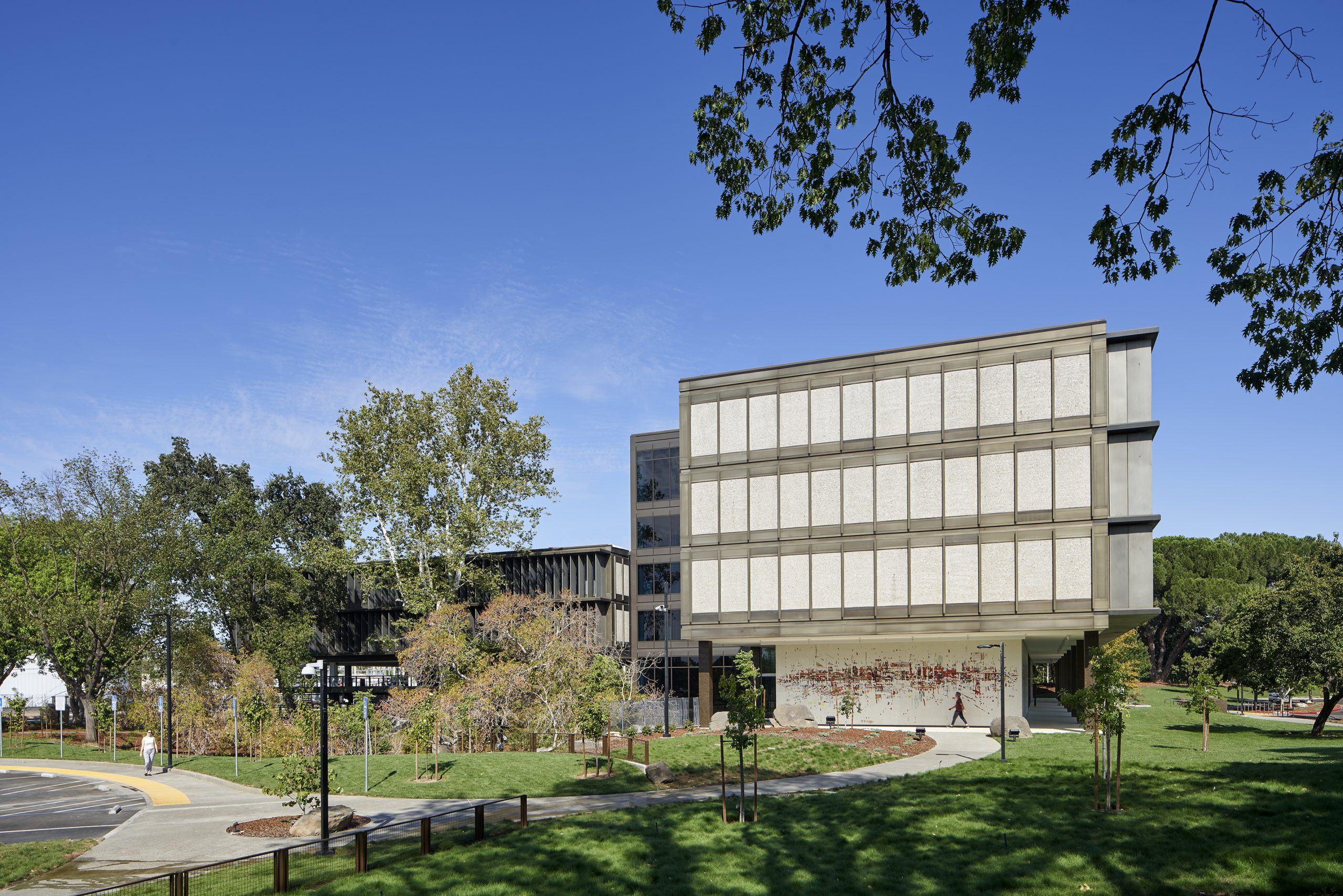
SMUD Headquarters Rehabilitation – Dreyfuss + Blackford designed the SMUD Headquarters building in the late-1950s and was commissioned 60 years later to renovate and rehabilitate the entire facility inside and out.
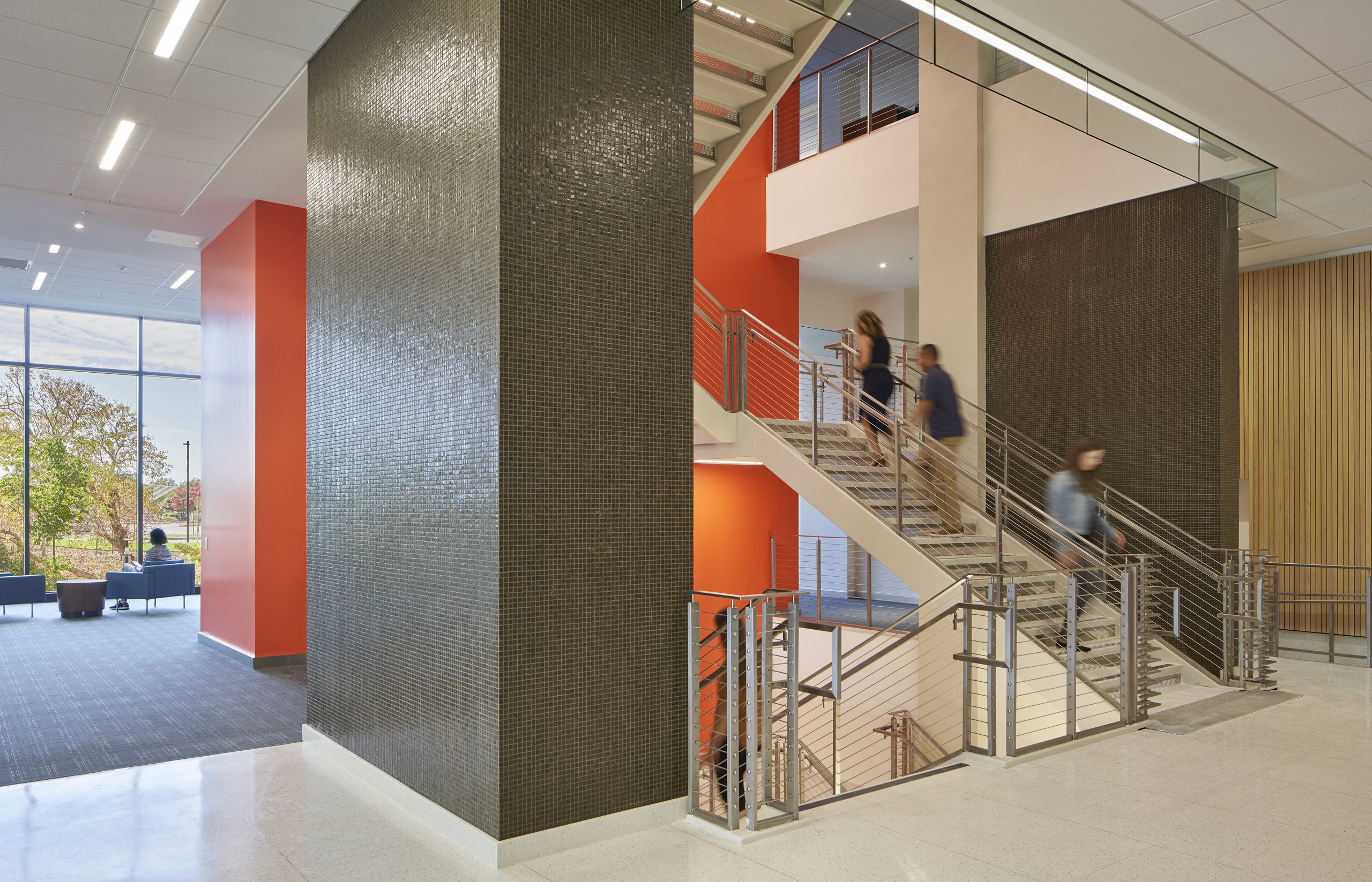
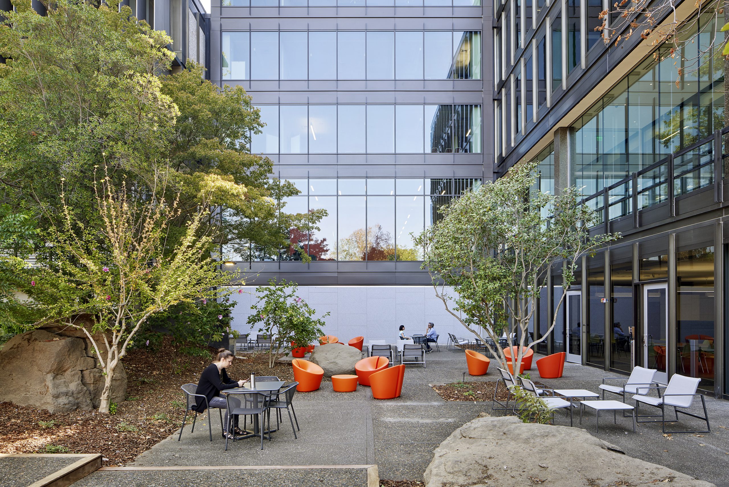
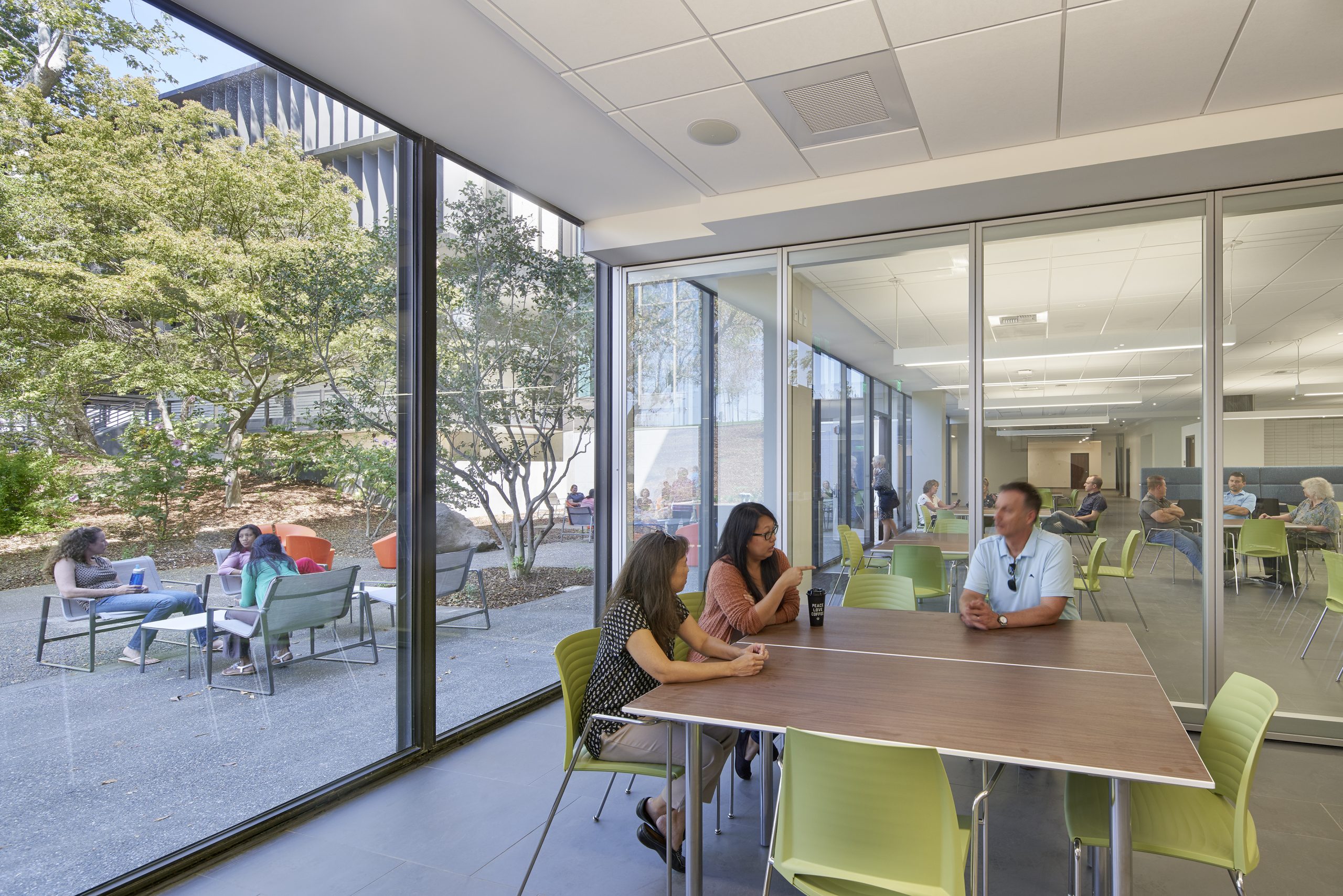
A carefully considered addition to the central core greatly increased daylighting and access to views. The central enclosed stair and mechanical shaft was replaced with a large open stair and offices were completely updated to include different types of conferencing, meeting and break areas with modern furniture and finishes. The SMUD Headquarters building and site is on the National Register of Historic Places and the rehabilitation was designed to be certified LEED Gold.
Architizer chatted with Kristopher Barkley from Dreyfuss + Blackford Architecture to learn more about this project.
Architizer: What inspired the initial concept for your design?
Kristopher Barkley: Though the building shell remained iconic and relevant and needed only restoration and cleaning, the interior spaces fared much worse. Alterations and remodels over the years resulted in a dingy workspace unsuited for current and future generations of staff. In addition, the building wings were isolated from each other, discouraging open communication between departments. Working with SMUD, we approached the project as a catalyst for change in the organization, redefining the organization’s goals for the next generation of staff. As the building was originally designed as a showcase for sun-shading and access to natural light, we focused on opening the only solid element of the building, the central stair and mechanical shaft.
What do you believe is the most unique or ‘standout’ component of the project?
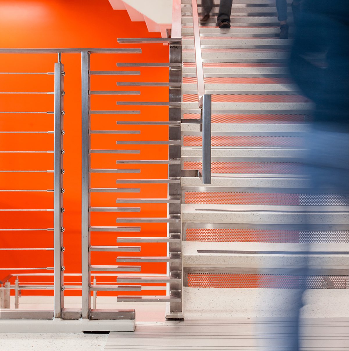
A generously day-lit open stair was added to replace a previously enclosed utility stair in the central core to enhance vertical circulation between garden level to fourth floor of the building. The new open stair allows for an airy and direct connection between building wings and provides an attractive alternative to elevator use.
The central core of the building was expanded by 20 feet on the west and east sides making more room for both staff meeting spaces and waiting or break areas on every level. On the west side of the first floor, a library commemoration area is used as a gathering point for tours as well as a waiting area for staff to meet each other or escorted guests.
What was the greatest design challenge you faced during the project, and how did you navigate it?
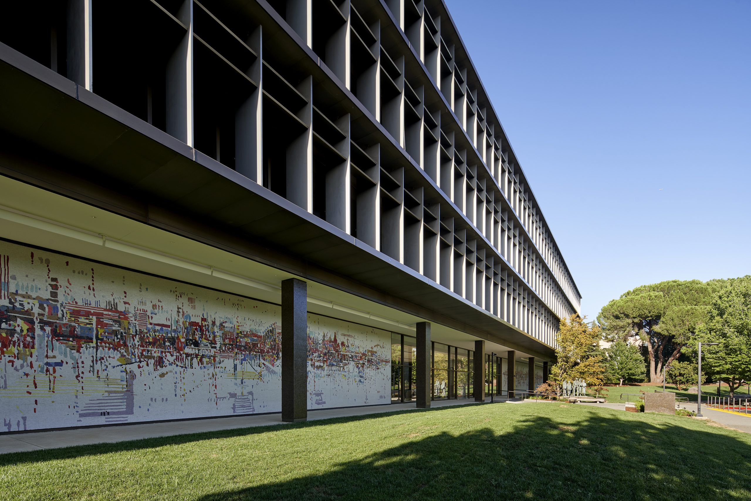
As the building is an important historical resource and serves as probably the most significant modernist icon in the region, every aspect of change was carefully scrutinized for adherence to established standards. The building additions needed to be compatible yet distinct while providing for enhanced daylighting and access to views.
The resulting design respects the overarching grid established during the original design and utilizes an exterior skin system that feels entirely natural when considered next to the existing elements of the façade.
What drove the selection of materials used in the project?
Sustainability, preservation, and product durability drove the selection of materials.
To decrease heat gain inside the building where windows were added to the west and east sides of the central core, Suntuitive Dynamic Glass by Pleotint was used. A self-tinting glass, it darkens gradually when heated by direct sunlight.
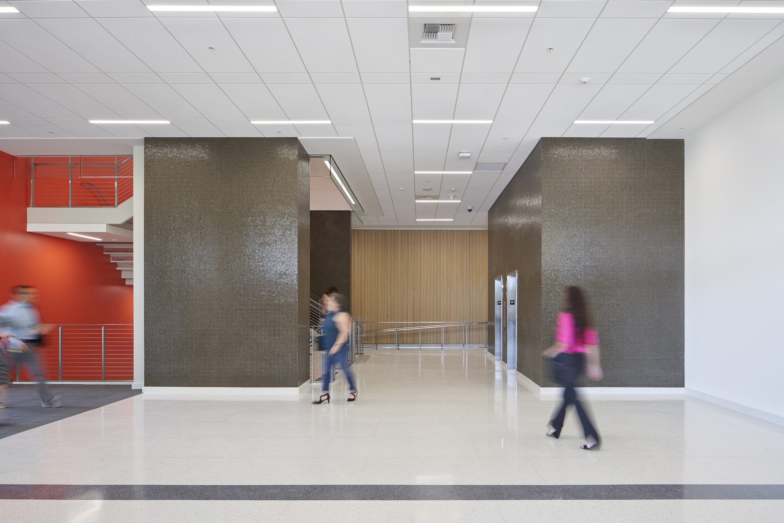
Additionally, bronze-colored Venetian glass mosaic tiles covered the original elevator lobby, tall planter walls, and enclosed stair on the main floor and was no longer available. A painstaking process began to find a closely matching tile for the new elevator lobbies and stair entrance. Kolorines in dark honey, a glass mosaic tile – typically used in pools – was chosen as a near-perfect match to the bronze-colored Venetian tile originally specified.
What is your favorite detail in the project and why?
The seismic stair railing. To account for potentially significant seismic drift at the main level of the building, a complex railing system was designed for the central open stair to allow for up to six inches of movement in any direction, while still providing complete fall protection as required by California Building Code (4” dia. sphere).
How important was sustainability as a design criteria as you worked on this project?
Sustainability was of utmost importance for this project. The rehabilitation of the existing facility would not have happened if sustainability was not the main goal. SMUD has served Sacramento for over 70 years and provides electricity to over 1.5 million customers. As a community-owned, non-profit electric utility, SMUD carries a responsibility to its ratepayers in assuring that their facilities serve as a working example of their core principles. This project does just that. It is an example to the larger community of what is possible when a building is rehabilitated and renovated instead of demolished.
In what ways did you collaborate with others, and how did that add value to the project?
We teamed with Wiss, Janney, Elstner Associates, Inc. (WJE), to assist with historic preservation. WJE’s historic architect for the project was Alan Dreyfuss, son of the late founder of our firm, Albert Dreyfuss. As a boy Alan visited the project numerous times with his father and was already completely familiar with it before work even started.
Also, in advance of design and construction, SMUD staged a series of community engagement discussions throughout Sacramento to inform the public and the preservation community about the intent and impact of the project. These discussions were largely centered around neighborhood impacts, treatment of the historical resource and the Thiebaud mural, and ways that the community would be able to interface with the organization once complete. This transparency built trust with residents while creating a strong connection to local preservationists.
Were any parts of the project dramatically altered from conception to construction, and if so, why?
The Headquarters Building rehabilitation included a complete renovation of the 120,000 square foot office interior and 45,000 square foot parking garage and includes an approximately 15,000 square foot expansion to the central core section.
The rehabilitation removed hazardous materials and provided upgrades to life safety, structural, and Americans with Disabilities Act (ADA) access while maintaining the building’s historical integrity. As a National Historic Register project, the exterior could not be significantly altered. All work was performed under review by several entities to assure compliance with The Secretary of the Interior’s for the Rehabilitation of Historic Buildings.
