A 1959 Modernist Office in Sacramento Shines Again
January 24, 2020
From the January 2020 online issue of
Metropolis Magazine.
By Lydia Lee
The building’s midcentury architecture was historically significant, so architecture firm Dreyfuss + Blackford’s upgrades had to be thoughtful and subtle.

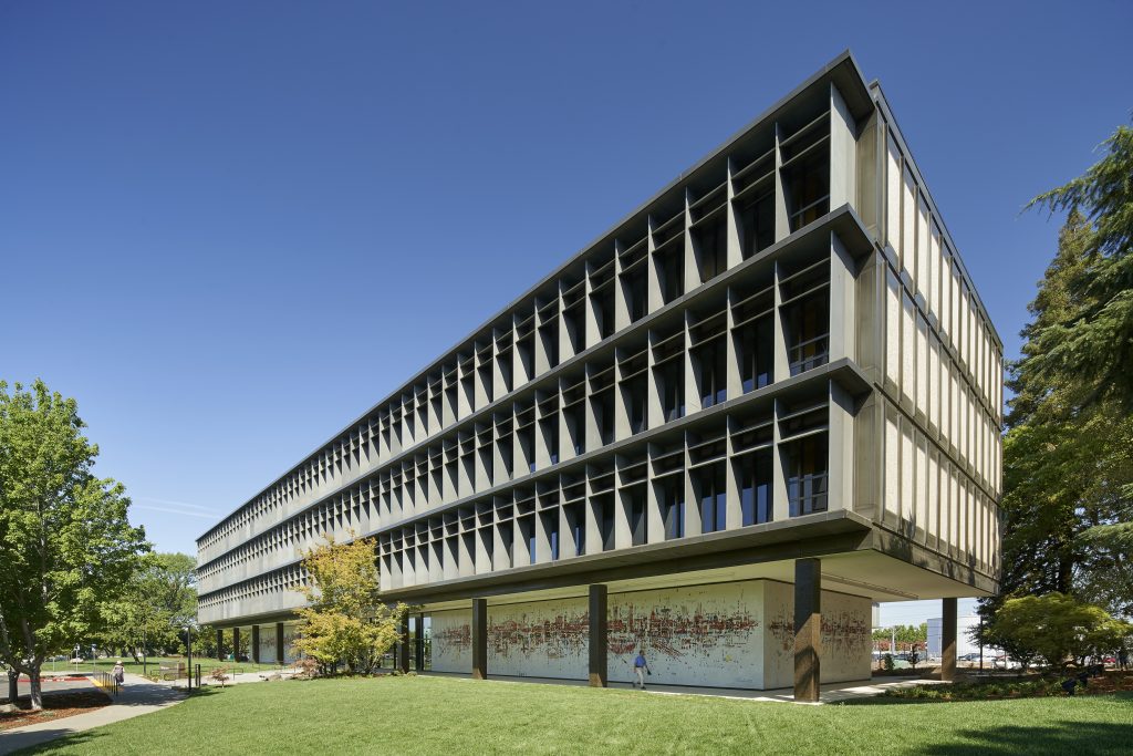
The Sacramento Municipal Utility District building was originally designed by Albert Dreyfuss and Leonard Blackford. Six decades later, the architects’ firm revisited the project through a renovation that brought the facilities into the 21st century. Photo by Bruce Damonte
In 1955, Albert Dreyfuss and Leonard Blackford were young architects in their thirties who had just landed the biggest project of their careers. They’d been commissioned to design the new headquarters of the Sacramento Municipal Utility District (SMUD), the public electric utility for the region. After convincing their new client to send them on a cross-country tour of the latest architecture, the duo returned inspired by the International Style of Mies van der Rohe’s buildings at the Illinois Institute of Technology and SOM’s Lever House skyscraper in Manhattan, among others. The 130,000-square-foot offices took on a correspondingly sharp geometry, but Dreyfuss and Blackford also found their own language for a “machine for living.” Among them were an unusual facade of movable fins to screen out the blazing Sacramento sun, and a signature mural by then-unknown artist Wayne Thiebaud.
Roughly 60 years later, the next generation of architects at Dreyfuss + Blackford was hired to update the facility, now listed on the National Register of Historic Places (and much beloved by the local architecture community). The work included removing asbestos, doing a seismic upgrade, and replacing the mechanical systems, along with a complete refresh of the interiors. The group approached this inheritance with a certain amount of trepidation.
“It was scary,” says Kristopher Barkley, president and design director of Dreyfuss + Blackford, who oversaw the modernization, which was designed to meet LEED Gold standards. “We wanted to retain the feel of the building and didn’t want to screw it up. Everything about the building was designed to be as efficient as possible, so there was no wasted space, making it difficult to change out lighting and other things in the ceiling plenum.”

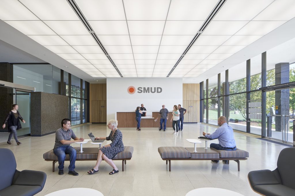
The lobby originally featured a luminous ceiling, which had been replaced by a dropped ceiling in the intervening years. For the renovation, the architects brought back the luminous ceiling. All the lighting in the building was upgraded to energy-efficient LEDs. Photo by Bruce Damonte
In addition, the building’s system of horizontal and vertical fins for solar screening—which even back in 1959 had been motorized on the east and west facades in order to track the sun—had continued to perform as intended. “As a result of this elaborate protective system, the sun never enters the building above the level of the desktops nearest to the windows,” extolled the May 1961 issue of Architectural Forum. “At the same time, the 450 occupants have the pleasant experience that comes from working inside an airy, glass-walled building.” The fins worked so well at shading the windows that when the architects looked into upgrading the building’s original single-pane glazing with double-paned, low-e windows, the return on investment didn’t pencil out.

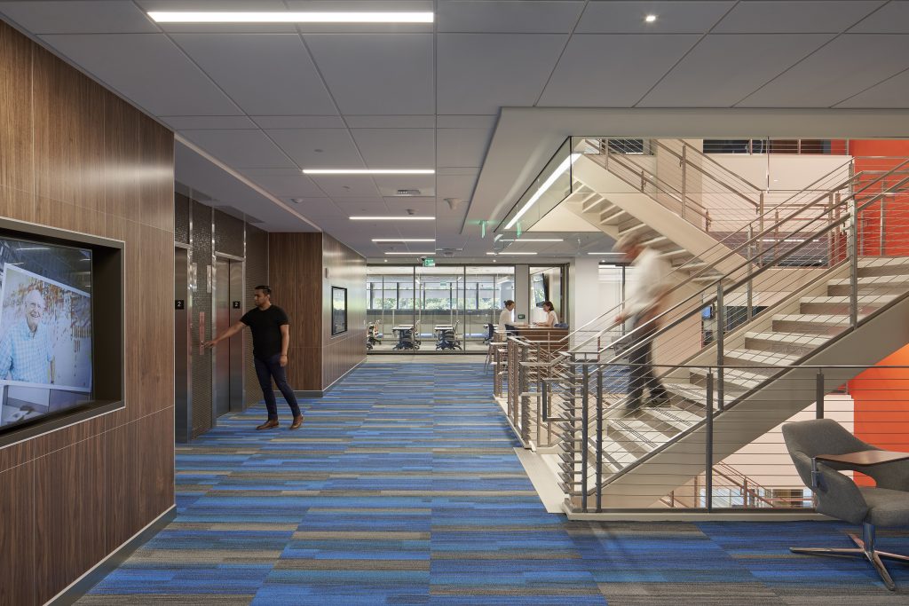
A new open stair at the core of the building represents the latest thinking in office design. The expanded core features a new coffee lounge at the top of the stairs, while the company cafeteria is located at the base of the stairs. Photo by Bruce Damonte
Instead, the architects worked on opening up the building’s central core, which held the elevator, enclosed stairwell, and a large mechanical shaft. This core previously featured an opaque facade, so the architects gave it a curtain wall of thermochromic glass to screen out the sun. They also expanded the core by about 15,000 square feet over six levels to create more lounge areas. They replaced the no-longer-necessary mechanical shaft with a new distributed HVAC system, and put in an open central stair to create an attractive alternative to taking the elevator.
The project also included the cleaning and repair of the 250-by-15-foot Venetian glass tile mosaic that wraps around the ground level of the building. Designed by Thiebaud, who was a friend of the original architects, Water City is the only public work by the renowned artist. The colorful, abstract mural brings personality and warmth to the rational architecture. “It adds a certain richness to the building that can’t be achieved by other means,” says Barkley. The design team also added some bright colors to the interiors in order to provide more visual interest and give each floor an identity. Concludes Barkley, “We think the building’s good for the next 60 years.”