Lost and Found
Jason A. Silva
September 8, 2016
If you told me 15 years ago I’d be designing parking structures, I wouldn’t have believed you. Yes, there was an increasing demand and somebody had to meet it; but it wasn’t going to be me. No way. Especially when I think back to when I was eight years old.
It was the 3rd of July. After watching fireworks over the river in downtown Sacramento, we headed back to our car. We entered the K Street Mall parking garage. A subterranean garage, it was scary in itself. My mom was driving and we got lost…in the parking structure. We drove around and around and couldn’t get out. We had no idea where we were going and I distinctly remember feeling panicked.
Fast forward to now. How I view parking structures has changed dramatically. Although some would go only as far as considering parking structures a “necessary evil,” I would say they can actually can be inherently positive by:
- increasing the density of vehicle parking allowing for better and smarter land use.
- reducing the surface heat island effect of regular parking lots.
- increasing transit use when combined with mass transit centers.
- helping users understand the true costs of vehicle use.
But that’s not why my perspective changed.

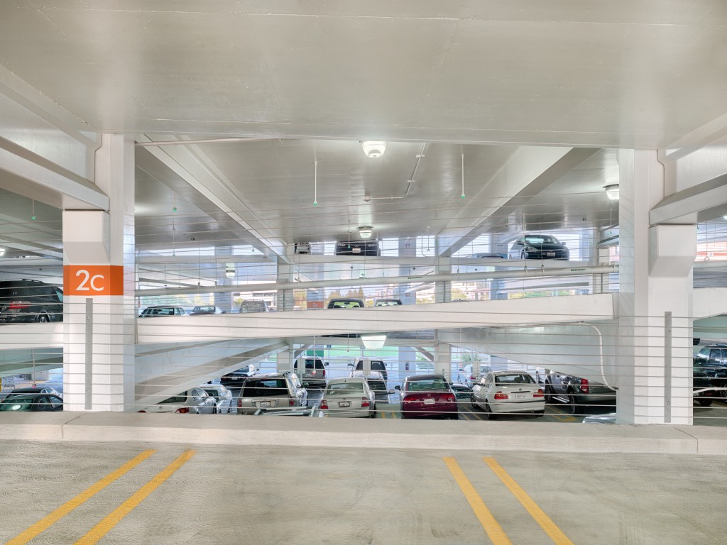
First level, Parking Structure III, UC Davis Medical Center
Like any architectural endeavor, parking is about people. When arriving at a campus, business, hospital or mall, the parking “experience” is considered the first and last impression of the visit. Why not have it be a good one…even a great one.
How can that be achieved?
1. Design for people first.
It’s not just about stacking cars, nor does it have to be the dreaded dark, oppressive garage experience of old. Parking structures can be quality environments. From simple functionality, to safety and security, users should feel at ease, maybe even look forward to the visit.
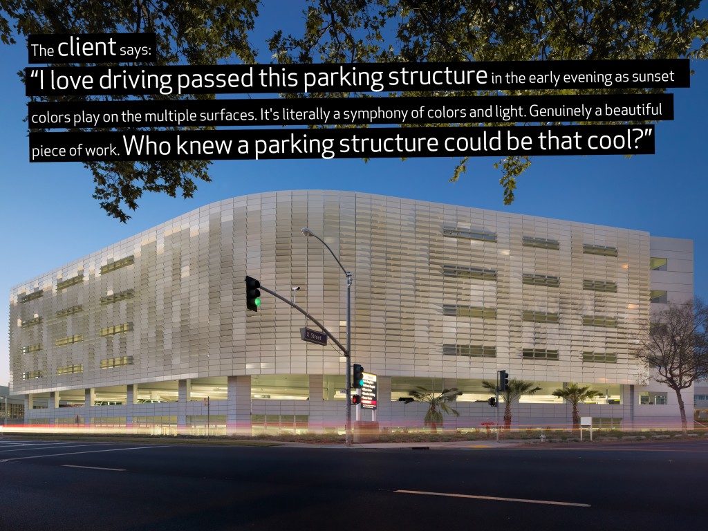
When combined with other design features like natural light and artwork, it can become a destination in itself, like 1111 Lincoln.
2. Make the transition in and out, as well as experience in the structure, have a positive impact.
When driving, you experience things from a singular and insulated perspective. Walking is a different story. When designing a good parking structure, both are key considerations.
As people enter and exit, the goal is to have the environment support the mode of transportation (walking, driving, wheelchair, et al) while being psychologically impactful in a positive way. Think convenience, relief, comfort, warmth; maybe even enjoyment. These perceptions are often largely influenced by the openness of the structure. Transparency, permeability and the like help mitigate the feeling of claustrophobia experienced by some users and transform that “awful, scary, anxious” feeling into one of confidence and assurance.
3. Use it as a canvas.
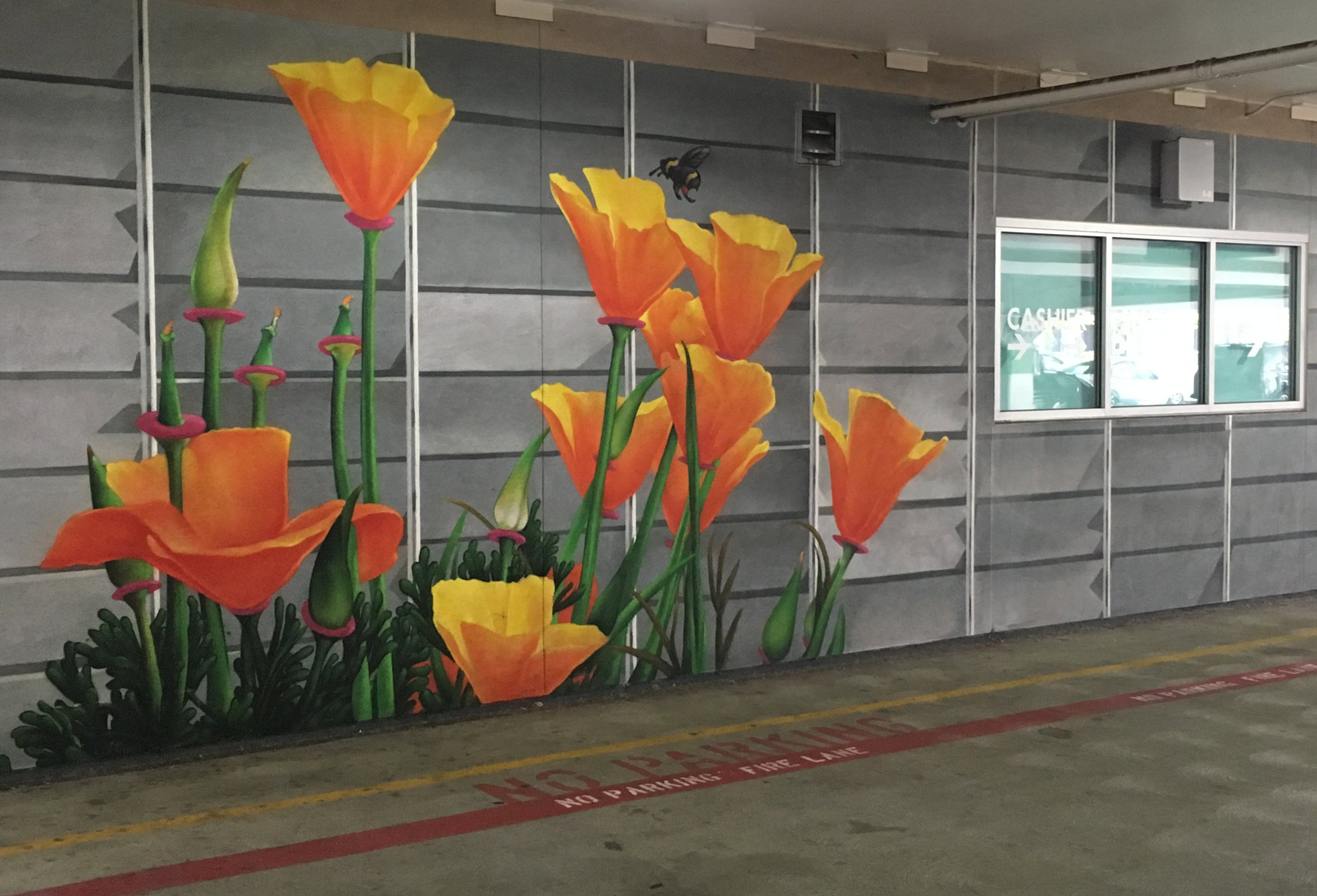
Parking structures make a great canvas that reflects more than just context. The structure design itself can yield this, as can incorporating artwork…literally. This can be interactive, too, changing with the time of day, the angle you look at the building or the different view from each floor. Not only can users enjoy driving in and out or look forward to walking by, the community at large will view the structure as a centerpiece rather than an eyesore.
At the end of the day, if you have to drive, you have to park. May as well make it an adventure in not getting lost and potentially finding something you never expected.

